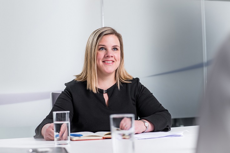
Hazel Davies: A splash of colour can be the ultimate mood booster for our homes
Cruden Homes’ sales and marketing director Hazel Davies explains the psychology of colour and the effect that has on our home and why, particularly in lockdown, we could benefit from introducing a bit of colour into our home to enhance our mood and wellbeing.

Hazel Davies
After the last 12 months we all need a bit of a lift, something that will help us to look forward with optimism and enthusiasm, so if you are looking for an instant boost, treat yourself to two little numbers.
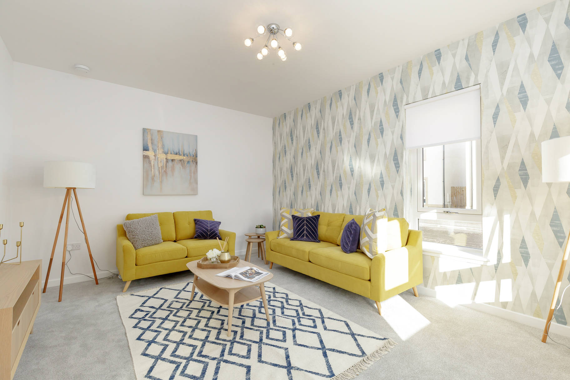
Take a dash of 17-504, add a splash of 13-0647 and see if that doesn’t put a smile on your face.
The reason? Well the first number is ‘ultimate grey’ and the second is ‘illuminating yellow’, and together they are Pantone’s ‘Colours of the Year’.
In 22 years of naming their top-trending tone, this is only the second time that Pantone has singled out two shades and they’ve done it in order to give us all a lift, describing their choices as “a marriage of colour conveying a message of strength and hopefulness that is both enduring and uplifting.” Put together the colours suggest watching the sun rise on a pebble beach, an experience that is both grounding and joyful at the same time.
It’s a reminder too that the colours we surround ourselves with can influence our state of mind, something that many people have become aware of now that they’ve been spending so much time at home. Those white walls that seemed so soothing when we only had to look at them in the evenings or at weekends may now seem stark and uninviting (or scuffed and grubby!), while all-over neutral shades can be lacking in personality and downright drab, especially during the winter months when daylight is in short supply.

So how do you use colour to make your home feel inviting; to create a sense of personal identity while, at the same time, linking it to the wider landscape?
It’s something that we’ve given a lot of thought to at Cruden Homes. Most recently, at our Longniddry development in East Lothian we’ve achieved it in our show home by using calm and soothing tones that make the most of the clear, coastal light. The coach houses, cottages and handsome villas that we are building at Longniddry reflect the architectural vernacular of the nearby stretch of coastline and the shifting tones of water, sand and sky are also working their magic indoors.
This is no seaside pastiche, there’s not a porthole mirror or lighthouse print anywhere in sight, instead there’s an organic feel to the natural tones and finishes that seem instantly soothing and at one with the environment.
Meanwhile, at sister company, Queensberry Properties’ mews homes, apartments and penthouses within the landmark Waverley Square development in Edinburgh, we’ve created a palette of subtle, yet sophisticated base colours, which have been enlivened by rich accents in jewel-like shades that anchor the homes to the long heritage of one of Europe’s great capital cities.
Here, just off the High Street, residents need only to step out of their front doors to be plunged into the culture and history of Scotland’s most famous street, and reflecting those influences through the use of strong colours makes emotional sense. The chosen palette also contains within it a sense of excitement and a reminder that life, in all its richness, will flood back in time.
So, should we take a tip from Pantone’s mood board for 2021 and fill our homes with grey and yellow? Well yes, if it feels right, and in seeking alternatives we shouldn’t stray too far from the underlying message being delivered by the world’s leading colour specialists, that there are tones and shades out there that can boost our mood, fill us with optimism and make us look forward to the days ahead.


